Textarea (Bootstrap)
Description
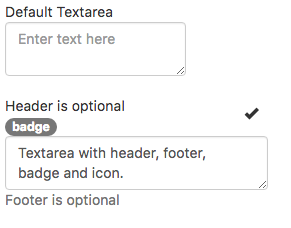
The Textarea control allows multiples lines of input text. It has optional headers, footers and other features.
Popovers and Tooltips are supported.
Properties and Methods
Standard properties are supported, plus:
| align | Text alignment. left, center or right. |
| autocapitalize | Automatically capitalize first letter? May not be available on other platforms. |
| autocomplete | Automatically complete words? May not be available on other platforms. |
| autocorrect | Spellcheck as entering? May not be available on other platforms. |
| badge | Adds a Badge to the control. Design Time and Runtime. |
| focus() | Sets the focus to the control. Runtime only. |
| footer | An optional message at the bottom of the list of items. Design Time and Runtime. |
| header | An optional message at the bottom of the list of items. Design Time and Runtime. |
| icon | An optional icon to appear at the top of the list. Design Time and Runtime. |
| maxlength | Maximum number of characters for text input. Not used for inputType number |
| placeholder | Text to be displayed in the field just as a comment – does not change the value. |
| readonly | If set to “True”, the control cannot be edited. At runtime, use readOnly. |
| required | If set to “True”, the field requires a value when the form is submitted. Design time only. |
| rows | Maximum number of rows to display. Design time only. |
| setSelectionRange(start, end) | Selects a range of characters. The first character starts at 0. Runtime only. |
| value | Gets or sets the value (true or false) of line i. Runtime. |
Events
Standard events are supported. For this control, the onfocusout event will be useful. It gets called when the user changes the focus to another field.
Example (Basic)
Call a function when user is done editing field.
Function Textarea1_onfocusout()
  MsgBox "Value is " & Textarea1.value
End Function
Example (JavaScript)
Call a function when user is done editing field.
Input1.onfocusout = function() {
    NSB.MsgBox("Value is " + Input1.value);
};
