MultiInput
Description
The MultiInput control is used to input one or more data items in a friendly format.
To add an MultiInput to your app, choose the MultiInput icon in the Toolbar. Use the Property Editor to set the properties. The onclick event can be used to check for clicks.
Properties
Standard properties are supported, plus:
| fieldType | bigfield or smallfield. bigField is as above. smallField reserves the left half for a prompt string – see ‘prompts’ property. |
| inputTypes | Specifies what kind of data will be input. Choices are color, email, number, password, range, search, tel, text and url. Comma separated list, with a inputType for each row. Default is text.Optional. |
| inputValues | A comma separated list of the initial contents of each row. Optional. |
| placeholders | A comma separated list of placeholders for each row. Placeholders are grayed out text to help the operator input. Does not appear for all inputTypes. Optional. |
| prompts | A comma separated list of prompts, one per row. Only used if fieldType is smallfield. Optional |
| refresh() | Recalculates the size of the scrolling area after additions or deletions. |
| rows | Defines the number of rows of input items. |
Events
MultiInput supports the standard events.
Example
Function Button1_onclick()
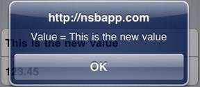
  MsgBox "Value=" & MultiInput1.getValue(1)
End Function

Function Button2_onclick()
  MultiInput1.setValue(1,"This is the new value")
End Function

