// JavaScript
Alert1.onclick = function() {
  NSB.MsgBox("You can display a message or take other action when clicked");
};
Spinner (Bootstrap)
Description
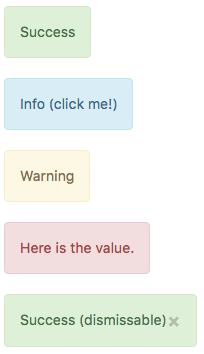
Provide contextual feedback messages for typical user actions with the handful of available and flexible alert messages.
By setting the appearance, alerts can have different colors. Turning dismissable on will add an x to the control. Clicking on it will cause the alert to be hidden, and your app will reformat to use the space which has been freed up.
Properties and Methods
Standard properties are supported, plus:
| appearance | Appearance of the alert. Can be success, info, warning, danger. |
| badge | Adds a Badge to the alert. |
| dismissable | Add an x to dismiss the alert? |
| value | The title of the button. HTML OK. Design time or runtime. |
Events
Standard events are supported. For this control, the onclick event will be most useful.
Example
' Basic
FFunction Alert2_onclick()
  MsgBox "You can display a message or take other action when clicked"
End Function
