TitleBar
Description
The Titlebar is used to display a title at the top of the screen.
It has the option of having buttons on the left or right hand size. These buttons can be text or images, and can have multiple sections.
To add a button to your app, choose the Titlebar icon in the Toolbar. It will automatically position at the top of the screen. Use the Property Editor to set the properties. Do not give any of your forms the same name as one of your buttons.
Properties
Standard properties are supported, plus:
| leftButtonName | The title of a button on the left. If there is more than one, separate by commas. If the name is home, info, setup, plus, minus, back or forward, a graphic is substituted. (Design time) |
| leftButtonStyle | leftnav for a left arrow button,
button for a plain button, blueleftbutton for a plain blue button. Only leftnav can have multiple styles or names. (Design time) |
| rightButtonName | Similar to leftButtonStyle. (Design time) |
| rightButtonStyle | Similar to leftButtonStyle. (Design time) |
| title | The text of the bar. (Design time) |
Events
In addition to the standard events, TitleBar has a modified version of onclick.
| onclick(choice) | The Name of the button that was clicked is passed to onclick() as a parameter. |
Example
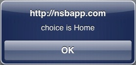
Function TitleBar1_onclick(choice)
  MsgBox "choice is " & choice
End Function
Output
Related Items
