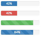
Progressbar (Bootstrap)
Description
Provide up-to-date feedback on the progress of a workflow or action with simple yet flexible progress bars.
By setting the appearance, Progressbars can have different colors.
Properties and Methods
Standard properties are supported, plus:
| animated | Animate the pattern on the bar? |
| appearance | Appearance of the alert. Can be default, success, info, warning, danger. |
| labelled | Display a % label on the bar? |
| max | Maximum value of bar. |
| min | Minimum value of bar. |
| striped | Add a striped pattern to the bar? |
| value | Gets or sets the value of the bar. Design time or runtime. |
Events
Example (Basic)
Progressbar1.value=100
Example (JavaScript)
Progressbar1.value=100;
