Hamburger (Bootstrap): Difference between revisions
| Line 30: | Line 30: | ||
| clear() || Clears all items. Runtime. | | clear() || Clears all items. Runtime. | ||
|- | |- | ||
| enable([''index'',]''bool'') || Enables items. ''Index'' can be an item or an array of items. If no index supplied, all items are affected. ''Bool'' is true or false. Runtime only. | | enable([''index'',]''bool'') || Enables and disables items. ''Index'' can be an item or an array of items. If no index supplied, all items are affected. ''Bool'' is true or false. Runtime only. | ||
|- | |- | ||
| icon || An optional [http://getbootstrap.com/components/#glyphicons icon] to appear at the top of the list. Design Time and Runtime. | | icon || An optional [http://getbootstrap.com/components/#glyphicons icon] to appear at the top of the list. Design Time and Runtime. | ||
Revision as of 12:20, 3 September 2016
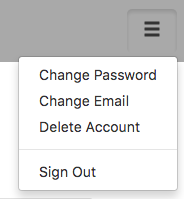
Normal view:
Expanded view:
Description
Hamburger is a context dropdown, usually placed in the top right corner of a form. It usually contains commands and option settings for the user. Its name come from its appearance - a top and a bottom with a filling in the middle. It is virtually identical to the Dropdown (Bootstrap) control - it works the same way, but has different defaults.
When the control is created, selection is set to undefined.
Two onclick events happen when a Hamburger is clicked. When the control is initially clicked, an event is sent. When the user makes a selection, onclick is called again with the text of the selection.
Popovers and Tooltips are supported.
Properties and Methods
Standard properties are supported, plus:
| addItem(item, type) | Adds an item to the end. type can be "checked" or "disabled" . Runtime. |
| appearance | Appearance of the alert. Can be success, info, warning, danger. |
| badge | Adds a Badge to the control. Design Time and Runtime. |
| clear() | Clears all items. Runtime. |
| enable([index,]bool) | Enables and disables items. Index can be an item or an array of items. If no index supplied, all items are affected. Bool is true or false. Runtime only. |
| icon | An optional icon to appear at the top of the list. Design Time and Runtime. |
| items | Items to show, one per line. Prefix * for disabled, > for selected, ! for heading (not all controls support headings). Design Time. |
| length | Current number of items. Runtime. |
| selection | Get the value of the selection (after an item is selected). Runtime. |
Events
Standard events are supported. For this control, the onclick event will be most useful.
Example (Basic)
Ignore the event when the Hamburger is first clicked, and handle the event when a selection is made.
Function Hamburger1_onclick(s)
    If typeof(s) == "object" Then Return

    If s ="Sign Out" Then
        Hamburger1.hide();
        butSignIn.show();
    ElseIf s = "Change Password" Then
        ' todo
    ElseIf s = "Change Email" Then
        ' todo
    ElseIf s = "Delete Account" Then
        ' todo
    End If
End Function
Example (JavaScript)
Ignore the event when the Hamburger is first clicked, and handle the event when a selection is made.
Hamburger1.onclick = function(s) {
    if (typeof(s) == "object") {
        return;
    }
    if (s === "Sign Out") {
        Hamburger1.hide();
        butSignIn.show();
    }
    if (s === "Change Password") {
        // todo
    }
    if (s === "Change Email") {
        // todo
    }
    if (s === "Delete Account") {
        // todo
    }
};
