Radiobutton (Bootstrap)
Description
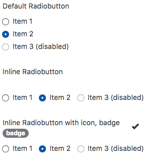
The Radiobiutton allows users to make a choice from a mutually exclusive group of items. Use the onchange event to detect it if has been clicked - the onclick event return the value before it has been changed.
Changing the disabled state for an item at runtime is easy. To change the third item of RadioButton1, do the following:
Radiobutton1_2.disabled = false
Popovers and Tooltips are supported.
Properties and Methods
Standard properties are supported, plus:
| addItem(item, type) | Adds an item to the end. type can be "selected" or "disabled" . Runtime. |
| badge | Adds a Badge to the control. Design Time and Runtime. |
| clear | Clears all items. Runtime. |
| footer | An optional message at the bottom of the list of items. Design Time and Runtime. |
| header | An optional message at the bottom of the list of items. Design Time and Runtime. |
| icon | An optional icon to appear at the top of the list. Design Time and Runtime. |
| inline | Display items horizontally? Design Time. |
| items | Items to show, one per line. Prefix * for disabled, > for selected, ! for heading (not all controls support headings). Design Time. |
| length | Items to show, one per line. Prefix * for disabled, > for selected, ! for heading (not all controls support headings). Design Time. |
| value | Gets or sets the current selection. Runtime. |
Events
Standard events are supported. For this control, the onclick event will be most useful.
Example (Basic)
Go through all the checkboxes and see which ones have been chosen.
Function Radiobutton1_onchange()
  MsgBox "Choice is " & Radiobutton1.value
End Function
Example (JavaScript)
Go through all the checkboxes and see which ones have been chosen.
Radiobutton1.onchange = function() {
    NSB.MsgBox("Choice is " + Radiobutton1.value);
};
