Bootstrap Grids
Bootstrap's Grid system is one of its best features. The designers of Bootstrap realized that apps for different sized devices should have different layouts, and this it should be made easy to do.
The way they implemented this works well with AppStudio. We have a number of features which make Bootstrap Grids easy to implement in your app.
Let's have a look.
Screen Sizes
Bootstrap allows you to have different designs for up to 4 screen sizes:
| Name | Description | Screen up to Width (pixel) |
|---|---|---|
| xs | Extra Small | 768 |
| sm | Small | 992 |
| md | Medium | 1200 |
| lg | Large | 1200+ |
Columns
Based on the width of the screen, you may choose to show your information using a different number of columns. A Extra Small screen may have one column, two for a Small screen and 3 for a Medium. Bootstrap lets you specify this.
A Bootstrap row is divided up into 12 sections. For each size, you can specify how many sections each column has. For example:
- A Extra Small screen could have one column 12 sections wide.
- A Small screen could have 2 columns, each 6 sections wide.
- A Medium screen could have 3 columns, each 4 sections wide.
- A Large screen could have 4 columns, each 3 sections wide.
Notice that in each case, the total of all the rows adds up to 12. (You can also have columns of unequal width: just make sure they still add up to 12.)
Bootstrap columns are completely responsive: they adjust automatically in width depending on the container they are in.
If the screen is not wide enough to display the columns, they will wrap.
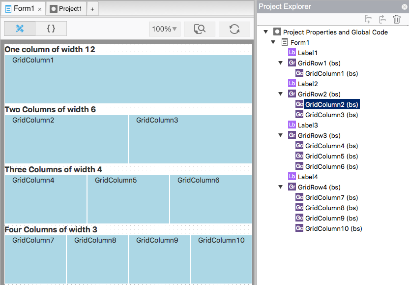
In this image, you can see how 1, 2, 3 and 4 columns appear in the Design Screen. Notice how the Project Explorer shows the GridColumns as children of the GridRows.
AppStudio GridRow
Now we know enough to create our own grid in AppStudio.
Calling them "Grids" is a bit optimistic. For our purposes, Grids have just one row, which you create using a GridRow control. If you need more than one row, use another GridRow. GridRows are pretty simple: their only job is to act as a container for GridColumn controls.
GridRows are created just like any other control in AppStudio: just drag from the Toolbox onto the Design Screen.
AppStudio GridColumn
GridColumns are almost as simple. Their main job is to act as containers for the contents of the row and column. Their only special properties are size: the number of sections xs, sm, md and lg sized screens will have.
Create GridColumns as you would any control in AppStudio, and set them as a child of your GridRow.
Filling a column
You can put any kind of AppStudio control into a GridColumn container. In the following, we have a GridRow with two GridColumns. Column A has a Label and a Panel. Column B has a Header and RadioButton
Nested Grids
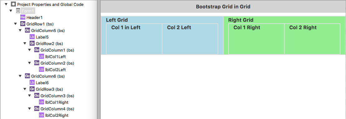
You can even put a grid inside a grid. In this example, we have GridRow, which contains two GridColumns (GridColomn5 and GridColumn6).
Inside GridColumn6, we have GridRow2. GridRow2 has two columns: GridColumn1 and GridColumn2.


