// JavaScript
Tabs1.onclick = function(i) {
  if (typeof i == "object") return;
  NSB.MsgBox("Tab chosen: " + Tabs1.value);
};
Tabs (Bootstrap)
Jump to navigation
Jump to search
This control is Bootstrap 3 only. Use Navs in Bootstrap 4.
Description
Provide tab links for your site or app with customizable appearance.
Popovers and Tooltips are supported.
Properties and Methods
Standard properties are supported, plus:
| addItem(item, type) | Adds an item to the end. type can be "active" or "disabled" . Runtime. |
| clear() | Clears all items. Runtime. |
| enable([index,]bool) | Enables and disables items. Index can be an item or an array of items. If no index supplied, all items are affected. Bool is true or false. Runtime only. |
| items | Items to show, one per line. Prefix * for disabled, > for selected, ! for heading (not all controls support headings). Design Time. |
| justified | Make tabs or pills equal widths of their parent at screens wider than 768px. On smaller screens, the nav links are stacked. Design Time. |
| length | Current number of items. Runtime. |
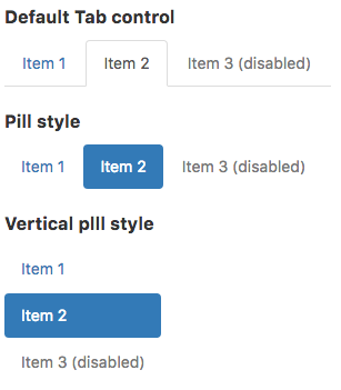
| pills | Show tabs highlighted with Pill format? tabs or pills. Runtime. |
| text | Get the text of the active tab. Runtime. |
| value | Get and set the active tab. Runtime. |
| vertical | Show Tabs/Pills vertically? (If so, >selected only works for Pills.). Design Time. |
Events
Standard events are supported. For this control, the onclick event will be most useful.
Example
' Basic
Function Tabs1_onclick(i)
  If TypeName(i) = "object" Then Exit Function
  MsgBox "Tab chosen: " + Tabs1.value
End Function
