A Field Guide to App Studio Controls: Difference between revisions
| Line 217: | Line 217: | ||
== Date == | == Date == | ||
[[file:Dateios.png]] | [[file:Dateios.png|thumb|200px|Date on iOS]] | ||
[[File:DateAndroid.png]] | [[file:Timeios.png|thumb|200px|Time on iOS]] | ||
[[File:DateAndroid.png|thumb|200px|Date control on Android Chrome]] | |||
The [[Date]] control allow you to enter dates. (iOS 5+) | The [[Date]] control allow you to enter dates. (iOS 5+) | ||
| Line 224: | Line 225: | ||
== DateTime == | == DateTime == | ||
The [[Datetime]] control allow you to enter dates and times. (iOS 5+) | The [[Datetime]] control allow you to enter dates and times. (iOS 5+) | ||
== Month == | == Month == | ||
The [[Month]] control allow you to enter a month and year. (iOS 5+) | The [[Month]] control allow you to enter a month and year. (iOS 5+) | ||
== Time == | == Time == | ||
[ | [The [[Time]] control allow you to enter a time. (iOS 5+) | ||
The [[Time]] control allow you to enter a time. (iOS 5+) | |||
Revision as of 19:54, 12 April 2015
Note: This page uses features only supported by mobile browsers (Android and Safari). It will not show properly in Internet Explorer.
Here are AppStudio's screen controls.
The appearance of these controls will differ based on the device they are running on, based on factors such as screen size, default UI specifications and operating system.
AppStudio supports multiple frameworks: jQuery Mobile and jqWidgets. A framework is a set of controls which share underlying formatting structures.
Each framework has its own features and advantages. If all your controls are from the same framework, your app size will be minimized and will have the most consistant look and feel.
- jQuery Mobile provides a set of attractive and powerful controls. They are not small, but run on a wide variety of platforms. It is open source and being very actively developed.
- The jqWidgets controls are a set of advanced controls that provide some amazing functionality. Full details can be found at jqWidget's website. The controls are free for non commercial use, $99 otherwise.
jQuery Mobile Controls
Here is an actual AppStudio App which uses them:
{{#widget:Iframe
|url=http://www.nsbasic.com/KitchenSink
|width=322
|height=480
|border=0
}}
General controls - all frameworks
Grid
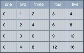
Use the Grid to display data that is in a table. You can specify titles, the number of rows and columns, together with their heights and widths, at design time. The value are filled in at runtime.
InputBox and NSB.InputBox
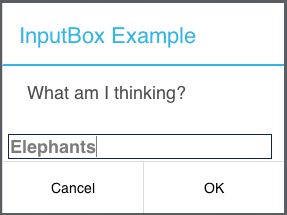
The InputBox brings up a one line modal input field. Use NSB.InputBox if you want to specify your own title. Both "Message area" and "Default text" can be set at runtime.
MsgBox and NSB.MsgBox
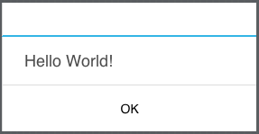
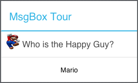
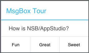
The MsgBox is a modal box that can be used to give messages to the user. It has the option of having a Cancel button as well. Use NSB.MsgBox to specify your own title, have multiple OK/Cancel buttons and to use custom icons.
jqWidgets Controls
jqWidgets is platform independent, cross-browser compatible framework which works on PC and mobile devices.
It is a commercial product, which depending on how you use it, requires a license fee. Complete details are here. The product is well supported.
Complete documentation is at jqWidgets.com.
Using jqWidgets
The jqWidgets samples use jqWidgets files directly from their website. This may not be best for you, since they can change these files at any time. A better way to use jqWidget's library is to download the files from jqWidgets, then copy the jqwidgets folder from it into your project folder.
Then, in the Project Properties of each jqWidgets control you use, change the value of 'pathTo_jqWidgets' to 'jqwidgets/'. Deploy will then use your copy of the files, not the ones on jqWidget's website. You will have control of when the files get updated.
Buttons
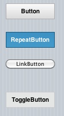
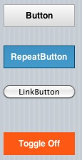
jqWidget's buttons have some features not found in other buttons: repeating and toggle among them.
Calendar
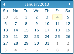
jqxCalendar represents a jQuery calendar widget that enables the user to select a date using a visual monthly calendar display.
Chart
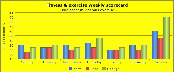
There's a powerful charting control. It can do column, line, area, stacked area, pie, bubble and scatter charts.
CheckBox

The jqxCheckBox widget displays a check box that allows the end-user to select a true, false or indeterminate condition.
ColorPicker
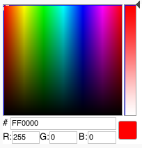
The ColorPicker control lets you easily select a color.
DateTimeInput
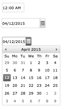
jqxDateTimeInput represents a highly configurable widget for displaying and selecting date and time values by using a popup Calendar display or by keyboard input into the text field.
Docking
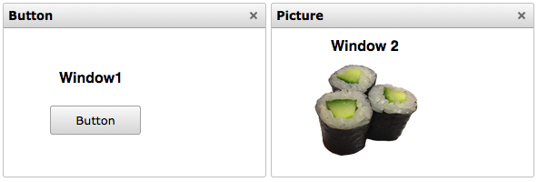
jqxDocking represents a jQuery widget which allows you to manage multiple windows and even the layout of your web page. Each window in the jqxDocking can be resized, dragged around the Web page, docked into docking zones, removed from the docking, collapsed into a minimized state to hide its content, expanded to display its content or pinned in place. With the jqxDocking API, you can Save or Load the Docking's Layout in JSON.
DragDrop
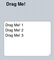
jqWidgets can make any other control draggable. An event can be fired when it is dragged onto another control.
Editor
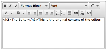
jqxEditor represents a ready-for-use HTML text editor which can simplify web content creation or be a replacement of your HTML Text Areas.
Grid
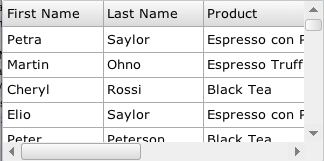
The Grid is a powerful jQuery widget that displays tabular data. It offers rich support for interacting with data, including paging, grouping, sorting, filtering and editing.
Input
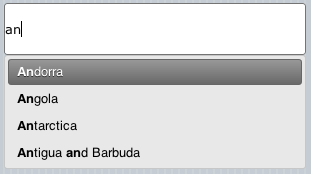
The Input widget provides suggestions while you type into the field. The datasource is a simple array, provided to the control using the "source" property.
ListBox
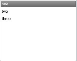
The jqxListBox represents a jQuery listbox widget that contains a list of selectable items.
MaskedInput
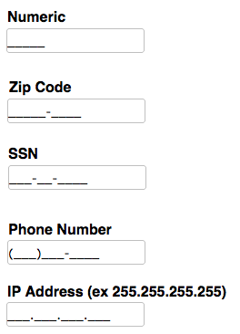
The jqxMaskedInput widget uses a mask to distinguish between proper and improper user input. You can define phone number, ssn, zip code, dates, etc. masks by setting the jqxMaskedInput mask property.
Menu
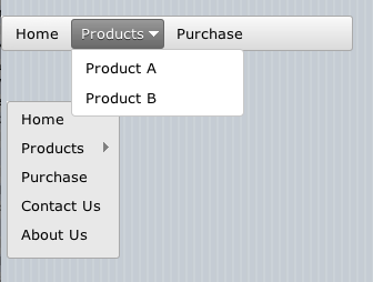
jqxMenu represents a jQuery menu widget that makes it easy to add menus to your app. With the jqxMenu you can create website menus, customized context menus, or application-style menu bars with just a small amount of scripting.
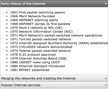
jqxNavigationBar is a versatile jQuery widget for building collapsible side-menu systems. It has header and content sections(like tabs). Users can expand or collapse a content section by clicking its associated header.
PasswordInput
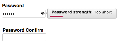
jqxPassword manages inputting passwords. It features the ability to measure the strength of passwords.
PhotoGallery
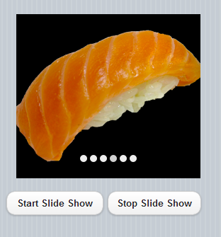
yqxPhotoGallery displays a slide show of images.
Rating
![]()
The rating control lets you enter and display a number of stars in a row.
RadialGauge
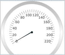
jqxRadialGauge displays an indicator within a range of values. Gauges can be used in a table or matrix to show the relative value of a field in a range of values in the data region, for example, as a KPI. It supports SVG and VML rendering.
SwitchButton
![]()
![]()
It's a simple on/off toggle, but has some nice customization features.
Tabs

Tabs let you organize more information on the screen.
Tree
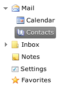
jqxTree represents a jQuery Tree widget that displays a hierarchical collection of items. You can populate it from 'UL' or by using its 'source' property.
Validator
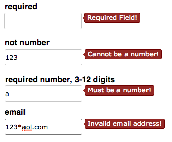
jqxTree represents a jQuery Tree widget that displays a hierarchical collection of items. You can populate it from 'UL' or by using its 'source' property.
Window
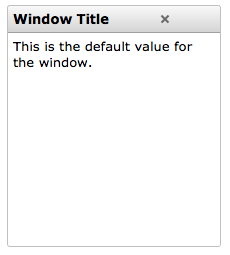
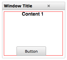
jqxTree represents a jQuery Tree widget that displays a hierarchical collection of items. You can populate it from 'UL' or by using its 'source' property.
MultiMedia Controls
Audio
![]()
The Audio control contains a sound and has the ability to play and pause it. It can show its controls or be invisible.
HTMLview
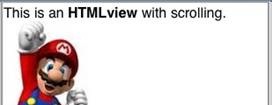
The HTMLView is used to display HTML formatted text. It can include any valid HTML, including links, JavaScript and CSS. It supports multi touch gestures.
Image

The Image control is used to display images. They can be jpg, gif, png or bmp. An image can be clickable, making it an easy to use PictureButton. It can also be moved at runtime, as a sprite.
PictureBox
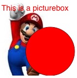
PictureBox allows you to draw images, text and graphics. It's based on HTML5's Canvas type and has numerous features.
Video

The Video control contains a sound and has the ability to play and pause it. It can show its controls or be invisible. On some devices, it takes over the entire screen while it is playing.
Financial & Social Media Controls
AdSense

The Adsense control allows you to earn money from advertising in your app.
![]() The Facebook control lets you add a 'like' button to your app.
The Facebook control lets you add a 'like' button to your app.
PayPal
![]() The PayPal control provides an easy way to collect a payment or a donation from a user. Tapping on it will bring up the PayPal Payments screen with the user and amount filled in - all they have to do is approve the transation. To use it, you need to have a PayPal Merchant Account (easy to set up), and use Merchant Services to create a button. Use the ID number it gives you in the properties of the button, and specify whether this is a Donation or Purchase. This feature will be handy for those selling commercial or donationware apps..
The PayPal control provides an easy way to collect a payment or a donation from a user. Tapping on it will bring up the PayPal Payments screen with the user and amount filled in - all they have to do is approve the transation. To use it, you need to have a PayPal Merchant Account (easy to set up), and use Merchant Services to create a button. Use the ID number it gives you in the properties of the button, and specify whether this is a Donation or Purchase. This feature will be handy for those selling commercial or donationware apps..
![]()
The Twitter control allows lets people follow your app.
Date and Time Controls
Date
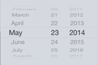
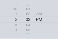
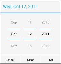
The Date control allow you to enter dates. (iOS 5+)
DateTime
The Datetime control allow you to enter dates and times. (iOS 5+)
Month
The Month control allow you to enter a month and year. (iOS 5+)
Time
[The Time control allow you to enter a time. (iOS 5+)
