A Field Guide to App Studio Controls: Difference between revisions
No edit summary |
|||
| Line 1: | Line 1: | ||
''Note: This page uses features only supported by mobile browsers (Android and Safari). It will not show properly in Internet Explorer.'' | ''Note: This page uses features only supported by mobile browsers (Android and Safari). It will not show properly in Internet Explorer.'' | ||
Here are | Here are AppStudio's screen controls. | ||
The appearance of these controls will differ based on the device they are running on, based on factors such as screen size, default UI specifications and operating system. | The appearance of these controls will differ based on the device they are running on, based on factors such as screen size, default UI specifications and operating system. | ||
AppStudio supports multiple frameworks: jQuery Mobile, Classic and jqWidgets. A framework is a set of controls which share underlying formatting structures. Certain frameworks, such as jQuery Mobile and Classic, are mutually exclusive. Putting them in the same project will lead to conflicts. The IDE will usually prevent you from doing this by accident. | |||
= jQuery Mobile Controls = | = jQuery Mobile Controls = | ||
jQuery Mobile provides a set of attractive and powerful controls. Here is an actual | jQuery Mobile provides a set of attractive and powerful controls. Here is an actual AppStudio App which uses them: | ||
| Line 29: | Line 29: | ||
[[File:Button.jpg]]<br><br /> | [[File:Button.jpg]]<br><br /> | ||
The Button control is used to cause an action in your program. | The [[Button]] control is used to cause an action in your program. | ||
== ButtonBar (Classic) == | == ButtonBar (Classic) == | ||
| Line 35: | Line 35: | ||
[[File:buttonbar.jpg]]<br> | [[File:buttonbar.jpg]]<br> | ||
The ButtonBar control lets you arrange two or three buttons, either as a titlebar or lower down on the form. This are usually used for apps with multiple forms to switch between. Each form will have a buttonbar control on it, with a different button highlighted. | The [[ButtonBar]] control lets you arrange two or three buttons, either as a titlebar or lower down on the form. This are usually used for apps with multiple forms to switch between. Each form will have a buttonbar control on it, with a different button highlighted. | ||
== Checkbox (Classic) == | == Checkbox (Classic) == | ||
[[File:Checkbox.jpg]]<br> | [[File:Checkbox.jpg]]<br> | ||
A Checkbox control is used to select a true or false value. It can have one or more items. | A [[Checkbox]] control is used to select a true or false value. It can have one or more items. | ||
== ComboBox (Classic) == | == ComboBox (Classic) == | ||
[[File:ComboBox.jpg]]<br> | [[File:ComboBox.jpg]]<br> | ||
Use the ComboBox to select a value from a list. The list is populated at runtime. | Use the [[ComboBox]] to select a value from a list. The list is populated at runtime. | ||
== Menu (Classic) == | == Menu (Classic) == | ||
[[File:Menu.jpg]]<br> | [[File:Menu.jpg]]<br> | ||
The Menu control give you a list of buttons to control actions. There can be one or more of them. | The [[Menu]] control give you a list of buttons to control actions. There can be one or more of them. | ||
== MenuNumberTitleDescArrow (Classic) == | == MenuNumberTitleDescArrow (Classic) == | ||
[[File:menuNumberTitleDescArrow.jpg]]<br> | [[File:menuNumberTitleDescArrow.jpg]]<br> | ||
The MenuNumberTitleDescArrow control shows a number (or word), title, optional description and an arrow. There can be one or more of them. | The [[MenuNumberTitleDescArrow]] control shows a number (or word), title, optional description and an arrow. There can be one or more of them. | ||
== MenuNumberTitleTime (Classic) == | == MenuNumberTitleTime (Classic) == | ||
[[File:menuNumberTitleTime.jpg]]<br> | [[File:menuNumberTitleTime.jpg]]<br> | ||
The MenuNumberTitleTime control shows a number (or word), title and optional time. There can be one or more of them. | The [[MenuNumberTitleTime]] control shows a number (or word), title and optional time. There can be one or more of them. | ||
== MenuTextBlock (Classic) == | == MenuTextBlock (Classic) == | ||
[[File:menuTextBlock.jpg]]<br> | [[File:menuTextBlock.jpg]]<br> | ||
The MenuTextBlock control shows blocks of text and an arrow. There can be one or more of them. | The [[MenuTextBlock]] control shows blocks of text and an arrow. There can be one or more of them. | ||
== MultiInput (Classic) == | == MultiInput (Classic) == | ||
| Line 75: | Line 75: | ||
[[File:showprogress.png]] | [[File:showprogress.png]] | ||
NSB.ShowProgress lets you put a temporary message on the screen. It can be dismissed by the user or by the app at any time. | [[NSB.ShowProgress]] lets you put a temporary message on the screen. It can be dismissed by the user or by the app at any time. | ||
== Slider == | == Slider == | ||
| Line 81: | Line 81: | ||
[[File:slider1.jpg]]<br> | [[File:slider1.jpg]]<br> | ||
[[File:slider2.jpg]]<br> | [[File:slider2.jpg]]<br> | ||
The Slider control allows you to have an input slider. (iOS 5++). | The [[Slider]] control allows you to have an input slider. (iOS 5++). | ||
== RadioButton (Classic) == | == RadioButton (Classic) == | ||
[[File:RadioButton.jpg]]<br> | [[File:RadioButton.jpg]]<br> | ||
The RadioButton presents a list of choices which are mutually exclusive. Selecting one deselects any others. (This control replaced OptionButton.) | The [[RadioButton]] presents a list of choices which are mutually exclusive. Selecting one deselects any others. (This control replaced OptionButton.) | ||
== TextArea == | == TextArea == | ||
[[File:Textarea.jpg]]<br> | [[File:Textarea.jpg]]<br> | ||
TextArea is a multiline input area. You can also specify autocapitalize, autocomplete and autocorrect. | [[TextArea]] is a multiline input area. You can also specify autocapitalize, autocomplete and autocorrect. | ||
== TextBox == | == TextBox == | ||
[[File:Textbox.jpg]]<br> | [[File:Textbox.jpg]]<br> | ||
TextBox is a single line input area. You can specify the type of input that is allowed: email, number, password,search, tel, text or url. Depending on the device you are running on, the appearance and pop up keyboard will be customized for the input type. You can also specify autocapitalize, autocomplete and autocorrect. | [[TextBox]] is a single line input area. You can specify the type of input that is allowed: email, number, password,search, tel, text or url. Depending on the device you are running on, the appearance and pop up keyboard will be customized for the input type. You can also specify autocapitalize, autocomplete and autocorrect. | ||
== TitleBar (Classic) == | == TitleBar (Classic) == | ||
| Line 103: | Line 103: | ||
[[File:TitleBar2.jpg]]<br> | [[File:TitleBar2.jpg]]<br> | ||
The TitleBar control sets the top bar on the screen. It has optional buttons on each side: either navigation style (arrow shaped) or plain. The buttons can have the default color or be blue. There are also a number of graphics that are substituted for specific button names. | The [[TitleBar]] control sets the top bar on the screen. It has optional buttons on each side: either navigation style (arrow shaped) or plain. The buttons can have the default color or be blue. There are also a number of graphics that are substituted for specific button names. | ||
= General controls - all frameworks = | = General controls - all frameworks = | ||
| Line 110: | Line 110: | ||
[[File:Grid.jpg]]<br> | [[File:Grid.jpg]]<br> | ||
Use the Grid to display data that is in a table. You can specify titles, the number of rows and columns, together with their heights and widths, at design time. The value are filled in at runtime. | Use the [[Grid]] to display data that is in a table. You can specify titles, the number of rows and columns, together with their heights and widths, at design time. The value are filled in at runtime. | ||
== InputBox and NSB.InputBox == | == InputBox and NSB.InputBox == | ||
| Line 116: | Line 116: | ||
[[File:Inputbox.jpg]]<br> | [[File:Inputbox.jpg]]<br> | ||
[[File:nsbinputbox.jpg]]<br> | [[File:nsbinputbox.jpg]]<br> | ||
The InputBox brings up a one line modal input field. Use NSB.InputBox if you want to specify your own title. Both "Message area" and "Default text" can be set at runtime. | The [[InputBox]] brings up a one line modal input field. Use NSB.InputBox if you want to specify your own title. Both "Message area" and "Default text" can be set at runtime. | ||
== MsgBox and NSB.MsgBox == | == MsgBox and NSB.MsgBox == | ||
| Line 123: | Line 123: | ||
[[File:nsbmsgbox1.jpg]]<br> | [[File:nsbmsgbox1.jpg]]<br> | ||
[[File:nsbmsgbox2.jpg]]<br> | [[File:nsbmsgbox2.jpg]]<br> | ||
The MsgBox is a modal box that can be used to give messages to the user. It has the option of having a Cancel button as well. Use NSB.MsgBox to specify your own title, have multiple OK/Cancel buttons and to use custom icons. | The [[MsgBox]] is a modal box that can be used to give messages to the user. It has the option of having a Cancel button as well. Use NSB.MsgBox to specify your own title, have multiple OK/Cancel buttons and to use custom icons. | ||
| Line 160: | Line 160: | ||
[[File:audio.jpg]]<br> | [[File:audio.jpg]]<br> | ||
The Audio control contains a sound and has the ability to play and pause it. It can show its controls or be invisible. | The [[Audio]] control contains a sound and has the ability to play and pause it. It can show its controls or be invisible. | ||
== HTMLview == | == HTMLview == | ||
[[File:HTMLview.jpg]]<br> | [[File:HTMLview.jpg]]<br> | ||
The HTMLview is used to display HTML formatted text. It can include any valid HTML, including links, JavaScript and CSS. It supports multi touch gestures. | The [[HTMLview]] is used to display HTML formatted text. It can include any valid HTML, including links, JavaScript and CSS. It supports multi touch gestures. | ||
== Image == | == Image == | ||
[[File:Image.jpg]]<br> | [[File:Image.jpg]]<br> | ||
The Image control is used to display images. They can be jpg, gif, png or bmp. An image can be clickable, making it an easy to use PictureButton. It can also be moved at runtime, as a sprite. | The [[Image]] control is used to display images. They can be jpg, gif, png or bmp. An image can be clickable, making it an easy to use PictureButton. It can also be moved at runtime, as a sprite. | ||
== PictureBox == | == PictureBox == | ||
| Line 179: | Line 179: | ||
== Video == | == Video == | ||
[[File:video.jpg]]<br> | [[File:video.jpg]]<br> | ||
The Video control contains a sound and has the ability to play and pause it. It can show its controls or be invisible. On some devices, it takes over the entire screen while it is playing. | The [[Video]] control contains a sound and has the ability to play and pause it. It can show its controls or be invisible. On some devices, it takes over the entire screen while it is playing. | ||
= Financial & Social Media Controls = | = Financial & Social Media Controls = | ||
| Line 186: | Line 186: | ||
[[File:adsense.jpg]]<br> | [[File:adsense.jpg]]<br> | ||
The AdSense control allows you to earn money from advertising in your app. | The [[AdSense]] control allows you to earn money from advertising in your app. | ||
== Facebook == | == Facebook == | ||
[[File:facebook.jpg]] | [[File:facebook.jpg]] | ||
The Facebook control lets you add a 'like' button to your app. | The [[Facebook]] control lets you add a 'like' button to your app. | ||
== PayPal == | == PayPal == | ||
[[File:paypal.jpg]] | [[File:paypal.jpg]] | ||
The PayPal control provides an easy way to collect a payment or a donation from a user. Tapping on it will bring up the PayPay Payments screen with the user and amount filled in - all they have to do is approve the transation. To use it, you need to have a PayPal Merchant Account (easy to set up), and use Merchant Services to create a button. Use the ID number it gives you in the properties of the button, and specify whether this is a Donation or Purchase. This feature will be handy for those selling commercial or donationware apps.. | The [[PayPal]] control provides an easy way to collect a payment or a donation from a user. Tapping on it will bring up the PayPay Payments screen with the user and amount filled in - all they have to do is approve the transation. To use it, you need to have a PayPal Merchant Account (easy to set up), and use Merchant Services to create a button. Use the ID number it gives you in the properties of the button, and specify whether this is a Donation or Purchase. This feature will be handy for those selling commercial or donationware apps.. | ||
== Twitter == | == Twitter == | ||
[[File:twitter.jpg]]<br> | [[File:twitter.jpg]]<br> | ||
The Twitter control allows lets people follow your app. | The [[Twitter]] control allows lets people follow your app. | ||
= Date and Time Controls = | = Date and Time Controls = | ||
| Line 208: | Line 208: | ||
[[File:date.jpg]]<br> | [[File:date.jpg]]<br> | ||
The Date control allow you to enter dates. (iOS 5+) | The [[Date]] control allow you to enter dates. (iOS 5+) | ||
== DateTime == | == DateTime == | ||
[[File:datetime.jpg]]<br> | [[File:datetime.jpg]]<br> | ||
The DateTime control allow you to enter dates and times. (iOS 5+) | The [[DateTime]] control allow you to enter dates and times. (iOS 5+) | ||
== Month == | == Month == | ||
[[File:month.jpg]]<br> | [[File:month.jpg]]<br> | ||
The Month control allow you to enter a month and year. (iOS 5+) | The [[Month]] control allow you to enter a month and year. (iOS 5+) | ||
== Time == | == Time == | ||
[[File:time.jpg]]<br> | [[File:time.jpg]]<br> | ||
The Time control allow you to enter a time. (iOS 5+) | The [[Time]] control allow you to enter a time. (iOS 5+) | ||
Revision as of 13:21, 29 January 2013
Note: This page uses features only supported by mobile browsers (Android and Safari). It will not show properly in Internet Explorer.
Here are AppStudio's screen controls.
The appearance of these controls will differ based on the device they are running on, based on factors such as screen size, default UI specifications and operating system.
AppStudio supports multiple frameworks: jQuery Mobile, Classic and jqWidgets. A framework is a set of controls which share underlying formatting structures. Certain frameworks, such as jQuery Mobile and Classic, are mutually exclusive. Putting them in the same project will lead to conflicts. The IDE will usually prevent you from doing this by accident.
jQuery Mobile Controls
jQuery Mobile provides a set of attractive and powerful controls. Here is an actual AppStudio App which uses them:
{{#widget:Iframe
|url=http://www.nsbasic.com/KitchenSink
|width=322
|height=480
|border=0
}}
Classic Controls
The Classic controls are easy to use and efficient. For these, we will show each control on its own. Many of these controls (the ones which are not marked "Classic") can also be used with the jQuery Mobile framework.
Button (Classic)
The Button control is used to cause an action in your program.
ButtonBar (Classic)
The ButtonBar control lets you arrange two or three buttons, either as a titlebar or lower down on the form. This are usually used for apps with multiple forms to switch between. Each form will have a buttonbar control on it, with a different button highlighted.
Checkbox (Classic)

A Checkbox control is used to select a true or false value. It can have one or more items.
ComboBox (Classic)
![]()
Use the ComboBox to select a value from a list. The list is populated at runtime.
Menu (Classic)
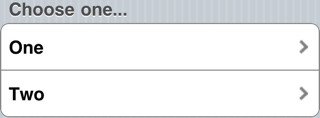
The Menu control give you a list of buttons to control actions. There can be one or more of them.
MenuNumberTitleDescArrow (Classic)
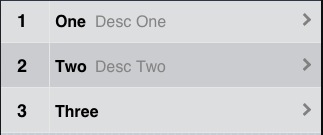
The MenuNumberTitleDescArrow control shows a number (or word), title, optional description and an arrow. There can be one or more of them.
MenuNumberTitleTime (Classic)
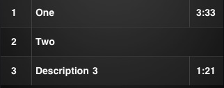
The MenuNumberTitleTime control shows a number (or word), title and optional time. There can be one or more of them.
MenuTextBlock (Classic)
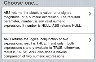
The MenuTextBlock control shows blocks of text and an arrow. There can be one or more of them.
MultiInput (Classic)

MultiInput allows you to have one or more input fields in a column. For each row, you can specify a placeholder, a default value and an input type (text, number, etc). It also has the option of putting a title in each input box.
NSB.ShowProgress
 NSB.ShowProgress lets you put a temporary message on the screen. It can be dismissed by the user or by the app at any time.
Slider
![]()
![]()
The Slider control allows you to have an input slider. (iOS 5++).
RadioButton (Classic)

The RadioButton presents a list of choices which are mutually exclusive. Selecting one deselects any others. (This control replaced OptionButton.)
TextArea

TextArea is a multiline input area. You can also specify autocapitalize, autocomplete and autocorrect.
TextBox
![]()
TextBox is a single line input area. You can specify the type of input that is allowed: email, number, password,search, tel, text or url. Depending on the device you are running on, the appearance and pop up keyboard will be customized for the input type. You can also specify autocapitalize, autocomplete and autocorrect.
TitleBar (Classic)
The TitleBar control sets the top bar on the screen. It has optional buttons on each side: either navigation style (arrow shaped) or plain. The buttons can have the default color or be blue. There are also a number of graphics that are substituted for specific button names.
General controls - all frameworks
Grid
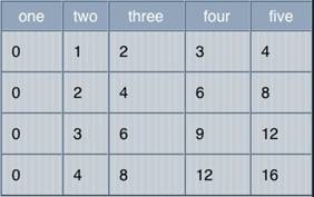
Use the Grid to display data that is in a table. You can specify titles, the number of rows and columns, together with their heights and widths, at design time. The value are filled in at runtime.
InputBox and NSB.InputBox
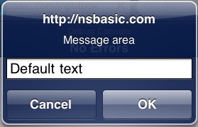
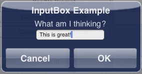
The InputBox brings up a one line modal input field. Use NSB.InputBox if you want to specify your own title. Both "Message area" and "Default text" can be set at runtime.
MsgBox and NSB.MsgBox

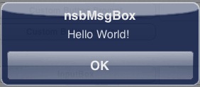
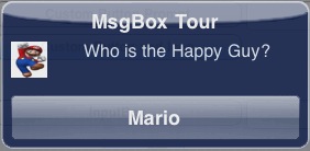
The MsgBox is a modal box that can be used to give messages to the user. It has the option of having a Cancel button as well. Use NSB.MsgBox to specify your own title, have multiple OK/Cancel buttons and to use custom icons.
jqWidgets Controls
The jqWidgets controls are a set of advanced controls that provide some amazing functionality. Full details can be found at jqWidget's website. The controls are free for non commercial use, $99 otherwise.
Buttons
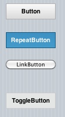
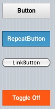
jqWidget's buttons have some features not found in other buttons: repeating and toggle among them.
Chart
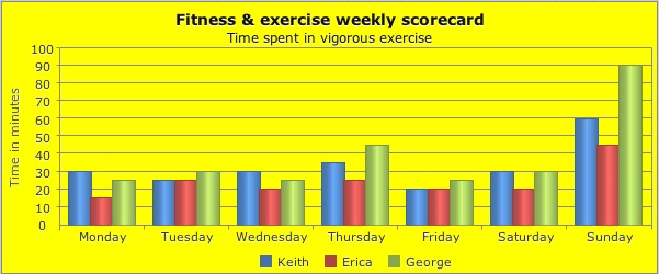
There's a powerful charting control. It can do column, line, area, stacked area, pie, bubble and scatter charts.
Drag
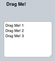
jqWidgets can make any other control draggable. An event can be fired when it is dragged onto another control.
Tabs

Tabs let you organize more information on the screen.
Toggle
![]()
![]()
It's a simple on/off toggle, but has some nice customization features.
MultiMedia Controls
Audio
![]()
The Audio control contains a sound and has the ability to play and pause it. It can show its controls or be invisible.
HTMLview
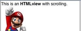
The HTMLview is used to display HTML formatted text. It can include any valid HTML, including links, JavaScript and CSS. It supports multi touch gestures.
Image

The Image control is used to display images. They can be jpg, gif, png or bmp. An image can be clickable, making it an easy to use PictureButton. It can also be moved at runtime, as a sprite.
PictureBox
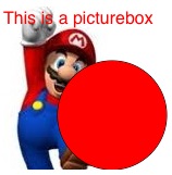
PictureBox allows you to draw images, text and graphics. It's based on HTML5's Canvas type and has numerous features.
Video

The Video control contains a sound and has the ability to play and pause it. It can show its controls or be invisible. On some devices, it takes over the entire screen while it is playing.
Financial & Social Media Controls
AdSense

The AdSense control allows you to earn money from advertising in your app.
![]() The Facebook control lets you add a 'like' button to your app.
The Facebook control lets you add a 'like' button to your app.
PayPal
![]() The PayPal control provides an easy way to collect a payment or a donation from a user. Tapping on it will bring up the PayPay Payments screen with the user and amount filled in - all they have to do is approve the transation. To use it, you need to have a PayPal Merchant Account (easy to set up), and use Merchant Services to create a button. Use the ID number it gives you in the properties of the button, and specify whether this is a Donation or Purchase. This feature will be handy for those selling commercial or donationware apps..
The PayPal control provides an easy way to collect a payment or a donation from a user. Tapping on it will bring up the PayPay Payments screen with the user and amount filled in - all they have to do is approve the transation. To use it, you need to have a PayPal Merchant Account (easy to set up), and use Merchant Services to create a button. Use the ID number it gives you in the properties of the button, and specify whether this is a Donation or Purchase. This feature will be handy for those selling commercial or donationware apps..
![]()
The Twitter control allows lets people follow your app.
Date and Time Controls
Date
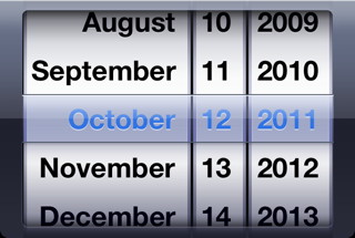
The Date control allow you to enter dates. (iOS 5+)
DateTime
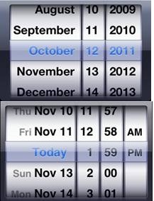
The DateTime control allow you to enter dates and times. (iOS 5+)
Month
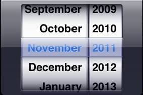
The Month control allow you to enter a month and year. (iOS 5+)
Time
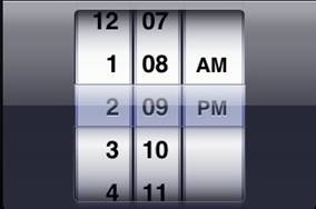
The Time control allow you to enter a time. (iOS 5+)

